How much do you know about home decoration colors?
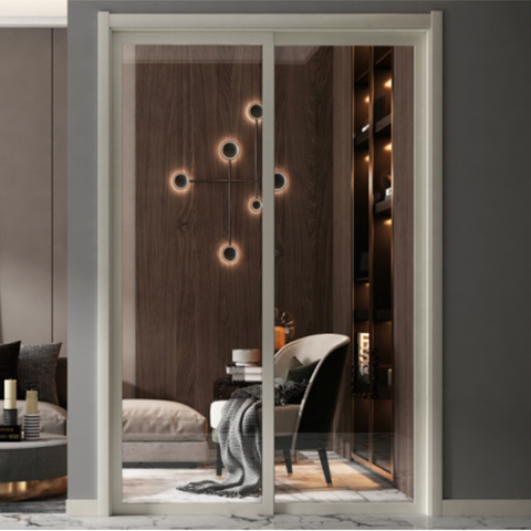
Home decoration is very important, and the choice of color for home doors and windows is equally important! Color matching has a law to follow, color will have its own emotions and thoughts, and doors and windows will "live" from this. So, how to choose color matching to make doors and windows "live"?
There are cool, warm and neutral tones, most of which are distinguished by psychological feeling. For example, red, orange, yellow and brown are mostly regarded as warm tones, blue, cyan and green are mostly cold tones, and the classic color matching of black, white and gray is an eternal aesthetic pursuit.
Before choosing doors and windows, we will look at a lot of decoration collocations. When looking at other people's designs, this is also good-looking, and that is also good-looking, but if you look at it too much, it will inevitably bring difficulties to your choice. Why is the decoration of other people's homes so beautiful? Why can other people's homes and doors and windows match the same?
In the home space, color is an intuitive impression, and it is also a factor that determines the overall atmosphere of the decoration. Choose the right color in the decoration, even if there is not too much decoration, it will show a better effect. If you want to show the right color matching, you must first know the basic three elements of color: hue, lightness, and purity. The so-called hue, in simple terms, is the main feature of the color, which presents people's intuitive feelings; lightness: refers to the brightness of the color, the higher the lightness, the closer to white, the lower the lightness, the closer to black; the purity: refers to the The saturation of the color, the higher the purity, the more positive the color, and the lower the purity, the closer the color is to gray.
1. Background color, theme color, embellishment color
The use of color in space is divided into background color, theme color, and embellishment color.
Background color: In simple terms, the background color is the color of the background board, which refers to the color of the top and bottom of the wall in a space;
Theme color: refers to the theme of the color in the space, that is, the color of the main furniture;
Embellishment color: refers to the color of soft accessories, which plays the role of embellishment in the space color.
2, common color collocation
Not necessarily all spaces need to control the visual senses through color. The following Baydee uPVC Profile introduces some classic color matching systems:
·Black and white gray brown
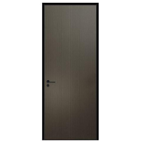
This color matching is a classic color matching. It is a must-have color system no matter where you are. Black, white and gray are neutral colors. No matter which of the three colors is the background color of the seat space, there is no sense of incongruity, and there will be no mistakes. Then A color that can be completely integrated into black, white and gray without any sense of incongruity is brown.
·Contrast color system
If you think black, white and gray are too light, you can try the contrasting color system, but you must be very cautious when using the contrasting color system. If you are not careful, the color matching will be very hot, so if you don't know the color matching knowledge, please understand. designer to do it.
·Log color system
Although black, white and gray is a classic color scheme, it is not suitable for everyone. Many people want their home to feel very warm, so the log color system is a very good choice. The top and bottom of the wall and everything you can think of Log colors can be used everywhere, but if the floor height is relatively low, it is not recommended to use logs on the ceiling, which will give people a sense of urgency.
· Morandi
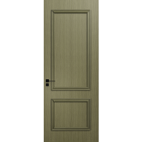
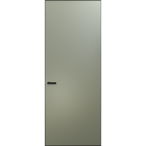
The Moranti color system can be said to be one of the most popular colors in recent years. This color system is a tones from a group of still life works by Italian painters. Moranti shades can be used in various combinations to create a soft home atmosphere. One of the main features of the Morandi color system is that the lightness and purity are low.
The above is the color collocation summarized by the editor for everyone. Color collocation is a knowledge and has always been a key factor in interior design. Different color collocation presents different decorative styles, which not only have aesthetic effects, but also show the designer's style. preferences and personality traits. It can express and adjust the role of indoor space and atmosphere, and produce corresponding psychological and physiological effects through people's perception and impression. Correct use of color aesthetics can help to change living conditions and create a richer and more comfortable space.
 Hot Recommendation
 Latest Products


